Billboard Reflection
|
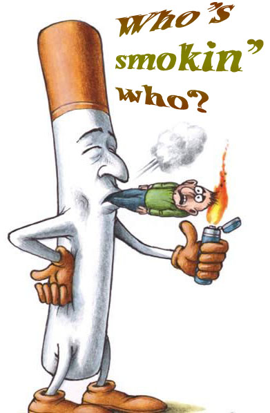
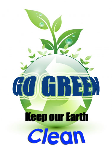
!. I like the differnent colors of my billboards and the simplicity of it. I wish my ideas would've been more original. 2.I could've take more time-brainstomed more. I wish I would've used more with the photoshop, becase there's so much you can do with it. 3. My first billboard is about smoking. It's very unhealthy for you and you're just smokin' yourself. The cigarette controls you and in a way take over you. My earth billboard is about recycling and keeping our Earth clean. Doing something little can make a difference and even if that little action might my insignificant, it should make you feel better and hopefully make the earth feel better too. 4. The colors that stand out in my cigarette photo are brown and green. The colors in my Earth photo are greens, because my message is "Go Green" and blue, blue to me can represent clean, and calm. peace.\ 5. I think the cigarette man clearly stands out well. 6. This is a perfect example for a Graphic Designer I think. The project is a good example of what to illustrate and use your creativity. 7. The first thing I did was look up public service announcements and picked out which ones were importnant to me. Then I used photohop. 8. Yes, it is worth while. |
|
