|
5C Reflection
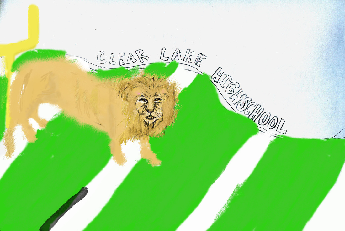
1. I think that I did the face of the lion well, there were a lot of details and I used different texture tools.
2. I could've put more time into the drawings, they could've been much better.
3. I created a lion prowling across a football field.
4. I used various colors and different shades and hues to create a texture look.
5. It was kind of awkward trying to meet expectations and more felt awkward for him because he has to chooose but it was a good experience.
6. I learned it's a tedious job and easy to get behind and easy to become obsesssed with one area and you need to focus more on the whole.
7. I did some wave deals in my design to make it look like movement and flow. I wanted them to be a little simple and not too obnoxious. It was prettty much planned.
8. It a good real graphic desgin project. But maybe a little intimdating with teachers judging them but it's a goood way to get a feel for what a graphic designer really doesn.
